Compare average scores and response rates at a glance.
- Identify high and low scores in seconds
- Download to use in reports and presentations
- Incredibly intuitive
- View any of your bespoke attribute
Article Content
2. Understanding Heatmap and the Confidentiality Threshold
3. Analysing a survey using heatmap
6. Additional filters in heatmaps
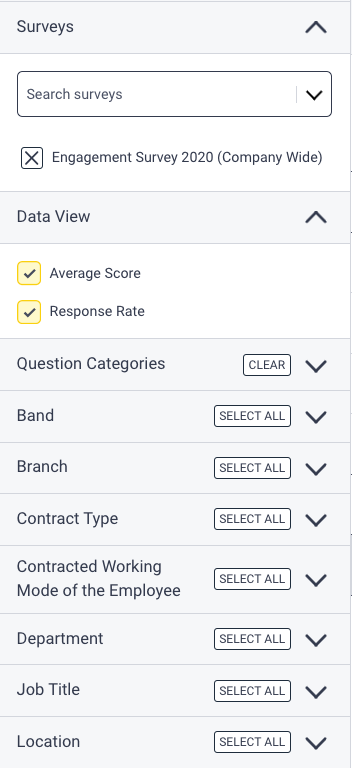
- Data view
- Average Score
- Response Rate
- Response count
- Sticky Headers
Heatmaps are colour-coded tables of all the scores and response rates from a particular survey, broken down by your bespoke segments. The heatmap shows the data in a clear and easy-to-digest format that you can easily download for reports or presentations, helping you to close the feedback loop!
Accessing heatmaps
There are two ways you can access heatmaps on your Hive dashboard.
- Heatmap icon in the navigation panel
- Heatmap tab in your survey dashboard
Accessing the heatmap feature
Heatmaps allows users to view the average score for each survey question, facilitating easy comparison across multiple surveys. Users can select multiple surveys, enabling a clear visual comparison of question-level performance.
To access heatmaps from the dashboard
- Click on the heatmap icon on the left side of your dashboard, you will be directed to the heatmap page

Accessing a survey heatmap
To access heatmaps within a survey,
- On the survey dashboard, click on the title of the survey to navigate to the survey
- Within your survey, click on heatmaps tab on the top of the screen

Understanding Heatmap and the Confidentiality Threshold
In a heatmap, you can view the average scores, response rates, custom indexes and metric scores across different segments of your organisation. Hive is 100% committed to protecting employee confidentiality, and this is reflected in how your data is displayed.
To ensure confidentiality, segments that do not meet your organisation’s confidentiality threshold will be greyed out and will not show any data. This means that if the number of respondents in a specific segment is too low, you won’t be able to see the results for that group.
The recommended minimum threshold is 6 responses. This allows you to filter and explore data meaningfully—by department, location, or other attributes—without ever being able to identify an individual.
- Your organisation sets the confidentiality threshold, and it remains consistent across the Hive platform.
- When applying filters to your heatmap, only segments that meet or exceed the threshold will display average score results.
For more information on how Hive keeps employee feedback safe and anonymous, check out:
Analysing a survey using heatmap
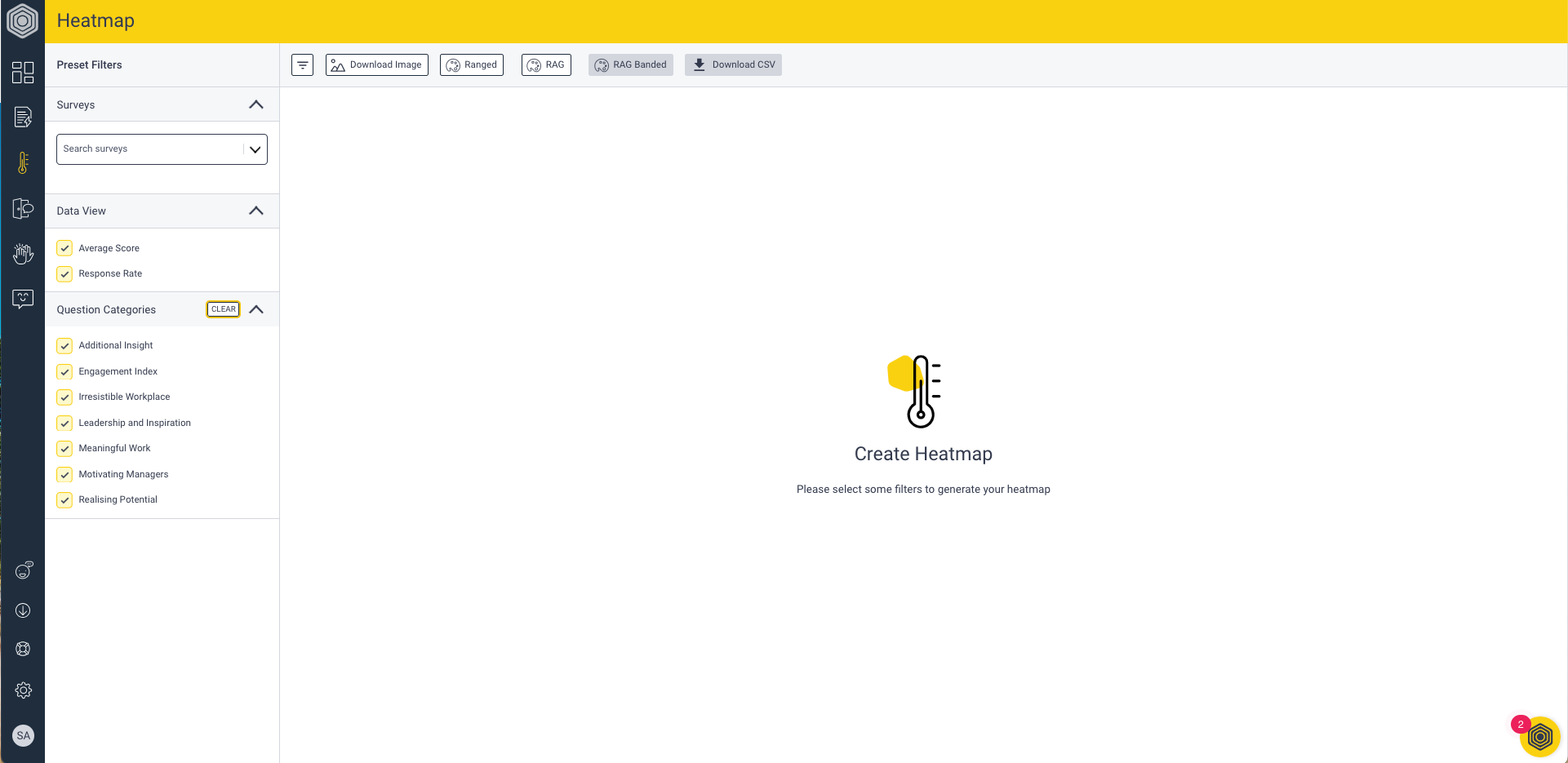
1. Open the Heatmap tab. The screen will initially be blank.


3. Select the segments you want to include. To add all segments in a filter, click Select All.
4. Click on the Re-generate button on the new dialogue box that appears on the screen.
The heatmap will update to display the results based on your selections, allowing you to compare data visually.
In ‘Single’ mode, selecting segments from different attributes displays each as an individual column, allowing you to compare them against each other and the organisation score. If you'd like to combine attributes — for example, viewing scores by location within each department — you can use Combined mode on the standalone Heatmaps page. See Combined heatmaps below.
Combined heatmaps
Combined mode lets you build multi-attribute breakdowns directly in the platform — for example, seeing scores by length of service within each location, all in one heatmap view
Combined mode is available on the standalone Heatmaps page (accessed via the heatmap icon in the left navigation). It is not available on the Heatmap tab inside an individual survey dashboard.
How to build a combined heatmap
- On the standalone Heatmaps page, switch the sidebar from Single to Combined mode. The filter panel splits into two sections: In Breakdown (top) and Not in Breakdown (bottom). All attributes start in Not in Breakdown.
- Select one or more segments from an attribute — for example, pick specific locations. That attribute group automatically moves into the In Breakdown section.
- Select segments from a second attribute — for example, pick length of service bands. That attribute also moves into In Breakdown, appearing below the first.
- Use the drag handles to reorder the attributes within In Breakdown. The top attribute becomes the group header that spans across the heatmap columns. The second attribute becomes the individual column values nested within each group.
- Click Update/refresh to generate the heatmap.
Tip: The heatmap doesn't update as you make selections — the Update button activates when you're ready to confirm your choices.
What you'll see
Columns are grouped and nested based on the order you set. For example, if Location is first and Length of Service is second, you'll see columns grouped by location, with each location broken down into individual length of service bands.
- Columns where the intersected segment has no respondents are hidden automatically — no empty columns clutter your view.
- Columns below the confidentiality threshold remain visible but are greyed out with dashes (—), so you know the segment exists even if scores can't be shown.
Exporting a combined heatmap
All visible columns, group headers, and nesting levels are included in the export. Note that exports reflect the last generated state - if you've changed your selections but haven't clicked Update, the export will show the previous view.
Sticky headers
When scrolling through a heatmap with many questions or many columns, the question column and the header row can be fixed in place.
- Scrolling right? The question column on the left stays visible, so you always know which survey question each row relates to.
- Scrolling down? The header row at the top stays visible, so column labels don't disappear as you move through a long list of questions.
Additional filters in heatmaps
You can find additional filters at the top of the heatmap

Data view:
The data view consists of 3 options Average Score, Response rate and Response Count
Average Score:
For segments that meet the threshold, the heatmap displays average scores across individual survey questions. These scores reflect the overall sentiment or performance for that segment. If a segment does not meet the organisation's confidentiality threshold, it will be greyed out to protect anonymity. The recommended confidentiality threshold is 6 responses. This ensures that data remains anonymous and individual responses cannot be identified.
Response Rate:
Each segment’s response rate is shown .This is the percentage of survey recipients who responded, calculated as the total number of survey responses divided by the total number of survey recipients from the selected segments.
- Due to the nature of the questions, response rates are not displayed for Result Segmentation Questions/Survey Specific Filters
- While the survey is live, the response rate section on the heatmap shows the live response rate of each selected filter. Monitoring this and encouraging participation can improve overall response rate
Response count: This gives the number of responses against each filter/segment.

Sticky headers
Sticky headers
When scrolling through a heatmap with many questions or many columns, the question column and the header row can be fixed in place.
- Scrolling right? The question column on the left stays visible, so you always know which survey question each row relates to.
- Scrolling down? The header row at the top stays visible, so column labels don't disappear as you move through a long list of questions.
Additional Filters:
Organisation:
Shows the organisational score for each question. This allows you to easily compare the score of a particular segment against the overall organisation’s score, providing context on how specific groups perform relative to the whole.
Filter Average:
This filter provides the average score of all the segments currently displayed on the heatmap. It’s useful for getting an overall sense of performance across multiple segments.
However, it’s important to note that if your filters include multiple attributes, the filter average may count some responses more than once, resulting in duplicated values.
Example, if you select filters for all departments and all locations simultaneously, the filter average might show a score roughly double the organisation’s score because the same responses could be counted in both the department and location segments.
On the other hand, if you select two segments within the same attribute (e.g., only two departments), the filter average will give a true average of those two segments, making it easier to compare them without duplication.

My View
My View shows a single combined score for your currently filtered dataset — the aggregate across all respondents matching your active filter selections.
This is different from the Filter Average column. Filter Average takes the average of all segment columns currently displayed, which can count the same respondent more than once if you've selected segments from multiple attributes.
My View uses the same AND logic as the Overview and Questions tabs, giving you a true combined score with no duplication.
For People Managers, My View reflects only the data within your authorised scope - consistent with how your view is calculated across the rest of the survey dashboard.
Change colour:
Sometimes it’s helpful to see data in different ways, that’s why Hive gives you the option to apply different styles to your heatmap! There are 3 styles for colour systems, each with their own benefits. Simply change between these by clicking the different colour filter on the page banner.
Ranged
Ranged displays the level of variance away from the most positive score/response rate for each question. In ranged, the colour gradients will change slightly depending on the scores/response rate for each question within the heatmap:
🟩 A shade of green will highlight the most positive scoring area for each question
🟨 A shade of yellow score/response rate will indicate a slight negative variance from the highest score
🟧 A darker amber score/response rate will be indicating an even greater negative variance
🟥 A red shade will indicate the lowest scoring area for each question.
A red score/response rate may not necessarily be a bad score/response rate, only the lowest in comparison to the other scores for the specific question. As you remove/add segments the colours will change.

RAG
In RAG, the colour shading is standardised and is not affected by the comparative scores/response rate. The minor variations in shading better demonstrates the difference between scores and consists of the ranges below:
🟩 A shade of green will indicate a score of 7 or above or response rate above 70%
🟨 A shade of yellow will indicate a score of 5–6.9 or response rate of 50%–69%
🟧 A shade of amber indicates a score of 3–4.9 or response rate of 30%–49%
🟥 A red shade will indicate a score below 3 or response rate below 30%

RAG (banded)
This is the default colour spectrum for Hive heatmaps and scores are the same as RAG, but shown as one of just four distinct colours to enable you to see more clearly which scores/response rates are positive, moderate, or require improvement or immediate action:
🟩 .Green will indicate a score of 7 or above or response rate above 70%
🟨 .Yellow will indicate a score of 5–6.9 or response rate of 50%–69%
🟧 .Amber indicates a score of 3–4.9 or response rate of 30%–49%
🟥 .Red will indicate a score below 3 or response rate below 30%


Download Image:
Save a snapshot of your heatmap analysis by clicking "Download Image" to receive a JPEG file of the displayed findings. This makes it easier to add to your internal reports or presentation.

Comparing two surveys
There are 2 ways to compare two surveys using the heatmaps. View mode now let’s you switch from the stacked heatmap view (default) to side by side view
To access the heatmaps:
- Click on the heatmap icon on the left side of your dashboard, you will be directed to the heatmap page.
The Side-by-Side Heatmap lets you compare two or more surveys in one view. No more scrolling or exporting to Excel just to see what’s changed.
How to use side by side view
- Go to the Heatmaps and pick 2 or more surveys you wish to display
- Click the View Mode in the control bar.
- Select ‘side by side’
- Your surveys will now be displayed in one heatmap view with each survey assigned a colour to easily track which scores belong to each survey.
How to use stacked view
- Go to the Heatmaps and pick 2 or more surveys you wish to display
- Click the View Mode in the control bar.
- Select ‘stacked’
- Your survey heatmaps presented one after the other.
In heatmap, you can find the Data view and Additional filters within the filter section unlike the heatmap tab on the survey results page.
Ready to explore your data like never before? Dive into your heatmaps and unlock a whole new layer of understanding. Your insights are just a click away!
- The heatmap feature has a Download CSV option. You can select 1 or more surveys to be downloaded as a csv on the heatmap feature.
- Two compare two dissimilar surveys the best way to analyse them is by using the question category filter
FAQs
- What’s the difference between viewing average scores or response rates within a heatmap?
- I’m on the heatmaps page but it’s blank?
- What filters can I use in my heatmap?
-
What data is being displayed for the response count and response rate in the Filter Average column?
- What’s the difference between the Combined Average and Survey Average row?
- How is the Combined Average and Survey Average rows calculated?
- Some of the columns are grey and empty… what does that mean?
- My heatmap doesn’t fit on the screen?
- What are survey-specific filters?
-
I can’t view the response rate for my survey-specific filters.
-
Will employees’ identities be protected when using using survey-specific filters?
-
What is Combined mode and how is it different from Single mode?
-
What is My View and how is it different from Filter Average?
What’s the difference between viewing average scores or response rates within a heatmap?
Using heatmaps to view average scores is most useful once a survey is closed, so that you can see all positive, moderate or low scores and the areas that need improvement.
When it comes to response rates, heatmaps are most beneficial when a survey is still open (so you can send out targeted reminders if necessary), and you can compare them to response rates over several closed surveys.
What is the response count row in the heatmaps?
The response count row displays the number of responses received from each segment alongside the existing response rates. This row allows you to better understand survey engagement levels and psychological safety.
Why is understanding psychological safety important?
Psychological safety is crucial for fostering an environment where employees feel comfortable expressing their thoughts and opinions. By monitoring response counts and understanding psychological safety indicators, organisations can create a more inclusive and supportive workplace culture.
I’m on the heatmaps page but it’s blank?
As default, your latest survey will selected and ready to go, but you’ll need to tick which segments you’d like to view! Simply select the segments you want to view and the heatmap will begin to build itself.
What filters can I use in my heatmap?
Just like analysing surveys in Hive, your bespoke attributes will be down the left column of the page (e.g. department, gender, location). All you have to do is select the segments you’d like to be included in your heatmap by individually clicking them or click “select all” to include the entire segment.
The filter sidebar will only show segments and attributes that are included in your selected surveys. This allows you to focus on only the relevant segments for your survey(s).
How can I use the filter average column?
The filter average column in Heatmaps displays the average scores for the segments that have been selected. It enables you to compare multiple groups of segments alongside the organisation's overall average.Simply select the desired segments or filters in Heatmaps, and the filter average column will automatically display the average scores for those selections.
What data is being displayed for the response count and response rate in the Filter Average column?
Response Count: The total number of survey responses from the selected segments.
Response Rate: The percentage of survey recipients who responded, calculated as the total number of survey responses divided by the total number of survey recipients from the selected segments.
What’s the difference between the Combined Average and Survey Average row?
Each survey that is selected and displayed in Heatmaps will have a survey average row, allowing you to gain an insight into a survey average for each segment you have selected (average of all selected questions for each segment.
A combined average row will appear at the end of all your Heatmaps, when you have loaded 2 or more surveys. This gives you insight into the average score, for each segment, across all surveys and questions that are displayed in Heatmaps..
Key information: The average which has been calculated does not include eNPS responses
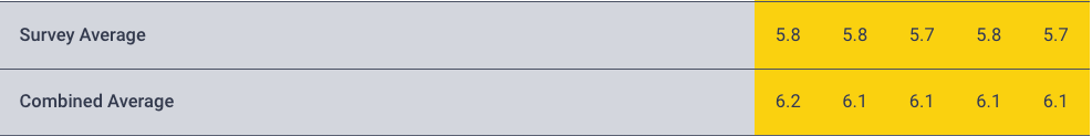
How is the Combined Average and Survey Average rows calculated?
Both average rows will only consider segments within a survey that surpass your organisation’s confidentiality threshold.
For example, if you select the 'male' segment and two surveys, Survey A has 6 male responses and Survey B has 1 male response, only the survey meeting or exceeding the confidentiality threshold will be included in the average row. This ensures a more robust safeguard for smaller response counts within the Hive platform.
Some of the columns are grey and empty 🤔 … what does that mean?
When you see a greyed out segment with no score or response rate, it means that the number of responses is below our confidentiality threshold.
My heatmap doesn’t fit on the screen?
Once you begin adding segments into the heatmap, they will appear as columns. If you continue to add segments, you will need to scroll to the right to view some columns. To help with this, we’ve added a simple “toggle filters” button just to the right of the filters, which will collapse the filters and allow you to see more of the segments.
What are survey-specific filters?
Survey-specific Filters in Hive enable you to selectively analyse survey results based on employee-identified characteristics. By incorporating Result Segmentation questions in your survey, you can filter responses according to the answers provided to these specific questions.
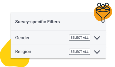
I can’t view the response rate for my survey-specific filters.
The absence of response rates for Survey-specific Filters in Heatmaps is due to the nature of these questions, which focus on gathering employee characteristics rather than traditional question responses. As a result, the response rate metric is not applicable to Results Segmentation questions.
Will employees’ identities be protected when using using survey-specific filters?
Yes, the confidentiality threshold still applies to these questions.
What is Combined mode and how is it different from Single mode?
In Single mode, each selected segment appears as its own individual column - useful for comparing departments, locations, or other attributes side by side.
In Combined mode (available on the standalone Heatmaps page), you can build multi-attribute breakdowns. For example, you could see scores for each length of service band within each location — all in a single view. The first attribute you add becomes the group header; the second becomes the individual columns nested within each group.
What is My View and how is it different from Filter Average?
Both My View and Filter Average give you an overall score for your selections, but they calculate it differently.
Filter Average takes the average of the segment columns currently displayed on your heatmap. If you've selected segments from more than one attribute (e.g. departments and locations), the same person may appear in both a department column and a location column — meaning they're counted twice. This can make the Filter Average appear higher than the true score.
My View uses the same calculation method as the Overview and Questions tabs. It counts each respondent once, giving you a true aggregate for your filtered audience with no duplication.
Why are some columns greyed out in my combined heatmap?
A greyed-out column with dashes (—) means that particular combination of segments falls below your organisation's confidentiality threshold. The column header stays visible so you know that group exists, but scores are hidden to protect individual anonymity. This works in the same way as standard heatmap behaviour.
My combined heatmap didn't generate - what happened?
If the attribute combination you've selected would produce more columns than the platform supports, the heatmap won't generate and an error message will appear. Try reducing the number of segments selected, or removing one of the attributes from your breakdown.